

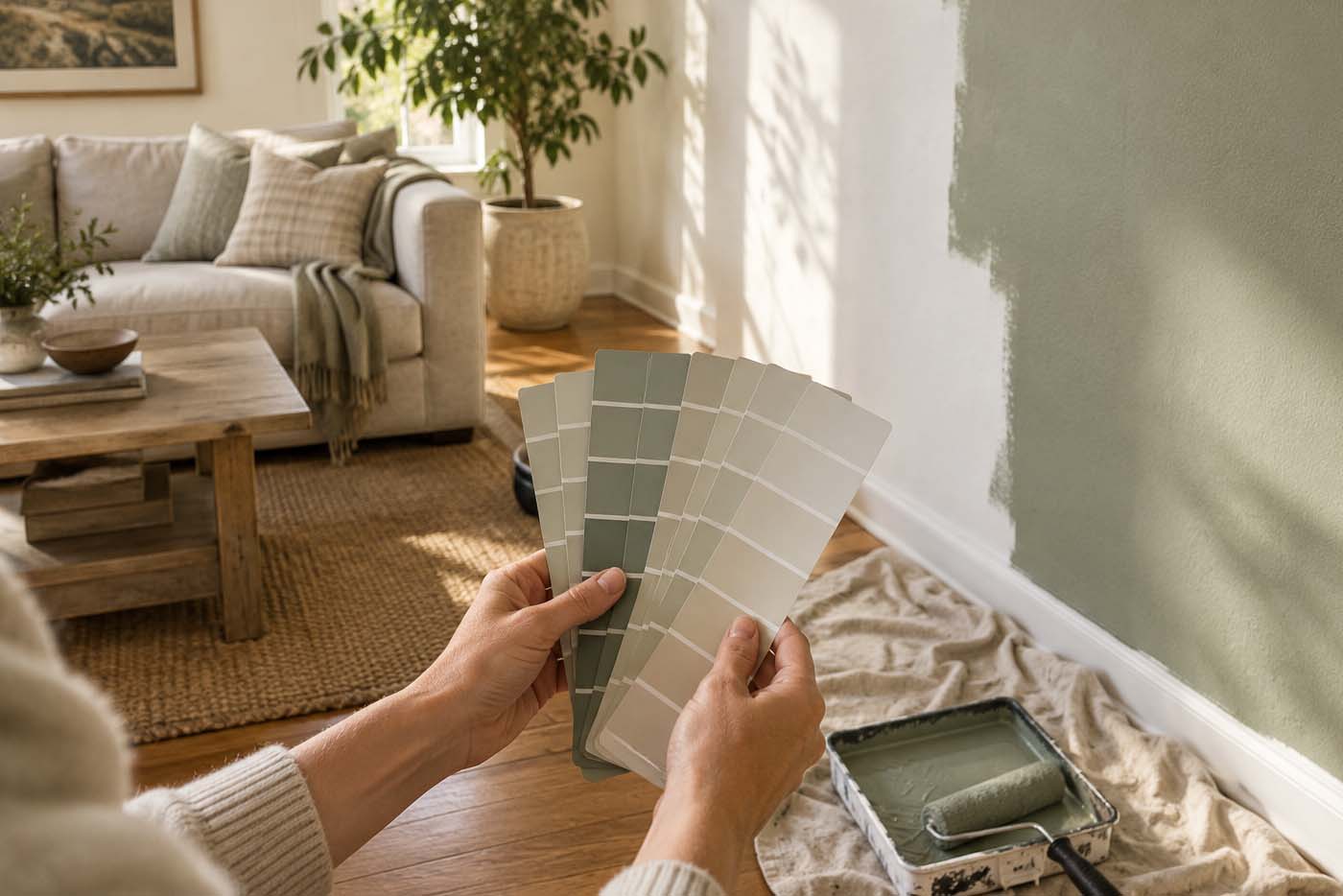
Making a harmonious house does not mean that every room must look alike. These rooms need to have a connection through the fact that they complement one another, and this can be attained through the use of colors. It is possible for each room to be unique yet still achieve harmony through the correct choice of colors in various rooms.
A cohesive home isn’t about matching every wall. It’s about choosing colors that know how to talk to each other.
Choose a Consistent Color Direction
The creation of a coherent home interior often depends on selecting colors for the entire space and not just individual rooms. The first step is setting the general direction: whether the home will lean warm, cool, neutral, or mixed. This doesn’t mean using the same wall color throughout, but working from a shared theme rather than a single shade. Another option is to start from the things already in the home: floors, furniture, cabinets, and other fixtures.
Once that direction is set, choose several colors to carry through the decorating process. Settling on three or more shades that complement each other is a good target. Undertones matter here: matching them keeps the whole interior looking coherent even when each room uses a different shade. Warm-colored hues in the living room, hallway, and bedrooms are usually a safe place to start.
How to spot an undertone before you buy:
- Hold the paint chip next to a plain white sheet of paper. Whatever color “leaks in” around the edges is the undertone.
- Look at the chip in both daylight and lamp light. Undertones shift more under warm artificial light than most people expect.
- Compare two “neutrals” side by side before assuming they match. A greige with a pink undertone and one with a green undertone can clash even though both read as “beige” alone.
Consider How Rooms Connect
The layout of a home affects how the color scheme should be arranged. Colors in adjoining areas should complement each other so the space looks good from every vantage point, which is part of why open floor plans make color relationships so visible. Contrasting colors can work well in connected rooms, but unrelated ones tend to clash.
Hallways and other transitional areas make it possible to run separate palettes in connected rooms while keeping a few unifying colors along the way. Trim and doors offer a natural opportunity to build new color relationships between spaces. It helps to think about the layout of the whole home rather than one room at a time.
The easiest cohesion shortcut:
Keep one trim color, usually a white or off-white, consistent throughout the connected rooms of the house. Even wildly different wall colors read as intentional when the trim ties them together. Changing trim color room to room is one of the fastest ways to make a home feel disjointed, even when the wall colors are fine on their own.
Repeat Colors Throughout the Home
Another way to build consistency is by repeating colors within the space. A color used on one room’s walls can show up again in furniture, accessories, or other painted surfaces elsewhere in the house. It doesn’t need to be the same shade or amount; repeating colors in subtle ways keeps the effect from feeling formulaic.
Paint can also be used to suggest a motif. If one room is painted a certain neutral, using that same hue in the hallway can help unify the space. Additional colors can be layered in as accents in smaller rooms or space-saving corners. Above all, paint should be used thoughtfully to suggest cohesion without becoming redundant.
Balance Color Intensity
Color intensity is another important factor in interior design. Rooms with several bright colors close to each other can start to feel flashy, which is why pairing warm colors with muted ones tends to create better contrast. Accents are a useful tool here too, since they draw attention to specific spots and help emphasize the focal points of a room. Choosing a few strong pieces of art to anchor a space is often a better way to add color punch than painting an entire wall in a saturated shade. A single piece of furniture positioned as a focal point can do the same job.
Room dimensions and lighting also affect how intense a color reads. A shade that looks perfect in a bright room can feel too bright in a dim one, so it’s worth testing a sample in the actual room before committing to it.
Reading a paint chip like a pro:
See also

Every paint color has an LRV, or Light Reflectance Value, on a scale of 0 (black) to 100 (white). It’s usually printed on the back of the chip or listed online. A room with limited natural light generally does better with an LRV above 50; darker rooms only get darker with a low-LRV color, no matter how nice it looks in the store.
Review the Home as a Whole
Before finalizing any colors, it helps to step back and look at how the rooms relate to one another, and how different areas blend together when viewed from various points in the home. This is why samples are more useful than judging a color in isolation; seeing how a scheme looks in your home’s actual lighting offers insight no swatch card can. A calm, uncluttered room also makes it much easier to judge a color scheme fairly, since a busy space can make even a well-chosen palette feel chaotic.
A color scheme should still represent the homeowners’ style. Every room doesn’t need the exact same palette, and mixing slightly differing shades together can still produce a well put-together home. If you’re drawn to combining styles, the same logic that applies to blending modern and traditional decor applies just as well to blending color: consistency of direction matters more than uniformity.
Before you buy the gallon:
- Paint a sample patch at least 2 feet by 2 feet, not a small square. Small swatches are notoriously misleading once scaled up to a full wall.
- Live with it for at least 2 to 3 days before deciding. A color that looks right the first morning can read completely differently by the second evening.
- Paint the sample on more than one wall if the room gets light from different directions. The same color often looks different on a north wall versus a south wall.
Achieving harmony through paint can feel like a daunting process, but a good blend goes beyond picking attractive colors on their own. It comes down to the relationship between colors, how they read in different lighting, and how they flow from one room to the next. Get that right, and you also sidestep one of the more common regrets homeowners run into: a palette that looked current for a couple of years and then didn’t.
Better Living may earn commissions through affiliate links and may occasionally feature sponsored or partner content. If you make a purchase through our links, we may receive a small commission at no cost to you.